
Aurora Mobile App
The Aurora app allows users to curate their social media feeds using convenient filtering features.
Project Overview
My Role: Product Designer, User Researcher, Data Analyst
My Partner: Kayla Hendrickson (Product Designer, User Researcher, Data Analyst)
Duration: 3 weeks
Tools: Pen & Paper, Figma, InVision, Google Forms, Miro, Zoom, Flowmapp, Trello
Platform: iOS
Summary: This project was completed as part of an open-ended design challenge with the Georgia Tech UX/UI Design Bootcamp. This was our final project before graduating, so we wanted to push ourselves creatively and tackle a difficult problem space. Inspired by the recent push for more ethical design in social media platforms, we chose to design our own version of a social app. We initially assumed that we would be designing for a less addictive social platform, but our research indicated that users are looking for more control over the content they see on their feeds. We found that most people can easily identify some negative effects from their social media use, and most have self-created boundaries to mitigate these negative effects. In an effort to support users in creating their ideal social media experience, we designed the Aurora app. Aurora is a social app that allows for user-curated feeds and more user control over what they see and when they see it. Our primary target users are people already active on social media but who want more control over the content they consume. Our secondary target users are people who do not currently use social media but who might if they had more control and boundaries when using the platform. The main constraints of the project were a lack of research budget and a 3-week timeline.

Team Pic via Zoom
👍 The Motivation
To brainstorm potential ideas, my partner and I did research on ethical issues in tech design. We came across the debate about how to make social media better for users because right now there are many concerns about the negative side effects social media has on people. Research on the addictive nature of social platforms has been mounting, and it raises questions about what for-profit companies owe to their users, and if for-profit companies can redesign their platforms without losing on profit margins.
🤔 The Challenge
To design a social app that better respects users’ boundaries while maintaining viability as a business product. Since my partner and I are both avid social media users we personally felt connected to the issue of the negative side effects that stems from social media activity. So it was exciting to take on this challenge and find a solution for what’s such a hot topic in the design community today.
😊 The Goal
Our goals for the project:
To build a positive explorative experience while allowing users to stay connected and feel inspired
To design elements/features through user empathy
Our goals for personal development:
Learn how to design and collaborate through Figma
Design a dark mode interface
Understanding the effects of Social Media
Social media apps are deliberately addictive to users. This article written by BBC was in part our foundation and early frameworks for developing our research. Statements such as “many designers are driven to create addictive app features by the business models of the big companies that employed them.” as well as quoted from Leah Pearlman, co-inventor of Facebook’s Like button, said, “she had become hooked on Facebook because she had begun basing her sense of self-worth on the number of “likes” she had.” shows how many of the intuitive features such as continuous scrolls, likes, notifications, and autoplay are actually meant to be purposefully addictive to the user to keep them “engaged” for endless periods of time.
Another article, Social Media Addiction, states Social media platforms such as Facebook, Snapchat, and Instagram produce the same neural circuitry that is caused by gambling and recreational drugs to keep consumers using their products as much as possible. In fact, psychologists estimate that as many as 5 to 10% of Americans meet the criteria for social media addiction today.
User Research and Data
Moving into our own research, we surveyed 85 people and did 7 user interviews.
We focused on both social media usage and the big picture of people’s whole social lives. One thing we did differently from previous projects is we conducted the survey first before writing our interview questions. This was helpful as our interviews were directed by the results of our survey.
Due to being in lockdown from COVID-19, we conducted our interviews via phone call.

The first thing we defined from our data is why do people use social media. According to our survey, people predominantly use social media to stay in touch with friends/family and for entertainment. The reasons why people DO use social media were a lot more consistent than frustrations that people expressed about social media, which we found interesting and unexpected.

For example, we heard a lot less about the addictive aspects of social media than we were expecting. What we did find, is that many people were easily able to identify the types of content they did and did not want to see, and many had built their own boundaries and strategies to avoid what they considered bad or negative content. We thought this was intriguing, because people choose what accounts to follow, and yet they still have to work to avoid certain posts on their feeds.
From these observations, we developed 3 user insights:
People predominantly use social media to stay connected to friends/family and to be entertained.
Users are often inadvertently exposed to content that has an impact on their mental health, which can lead to disengagement from social platforms.
Users mindfully restrict their social media usage.
To fully understand our users we developed an empathy map. Social media users are obviously a very broad demographic, so it was difficult to accurately empathize with all of them.
From our interviews, we narrowed down to two user groups:
Our primary user group is the frequent social media user. This person loves seeking connection and inspiration from social media but is bothered by the lack of reliable information on these platforms. This can manifest itself in many ways, from influencers with unrealistic lifestyle Instagrams, to fake political news. People, in general, do not like feeling misled.
Our second user group is the infrequent or non-user of social media. This person likes consuming content that they find interesting and reflective, but they are turned off by the like-seeking content on many platforms.
A typical Aurora user:

Because of our limited time frame, we focused on our primary user group, so we generated this user persona to represent them. Anika is young and social, with many hobbies and interests. She loves feeling connected to the outside world and her friends but she occasionally takes breaks from social media as she finds it can be overstimulating and exhausting.
😫 The Problem
Users don’t have enough control over the content on their social feeds due to the current logic of algorithmic feed curation.
What does this really mean? Well, the current logic of feed curation is that, for most platforms, all of your content is in one place, and content is organized by what an algorithm guesses you want to see the most. The problem with this system is that it’s not able to account for the nuances of what a user might want to see at a certain time of day, or when they’re in a certain mood.
More simply, overexposure all at once can lead users to constantly mixed emotions.
Aurora’s Value Proposition
💡 Give users control over their social media feeds so they can see what they want when they want.
Featured Solutions
We ended up with two main features that we felt would have the most positive impact on our users:
allowing users to have different feeds for different content
allowing users to set reminders to warn them of high usage.
However, since the second feature is something already available in competing apps (found through our competitor analysis), we focused most of our design on having different feeds.
Competitor Analysis
Before diving into feature ideation, we completed an analysis of some of our largest competitors. This helped us get a feel for what was already being done in the social media space. The most obvious advantage of our direct competitors is the large market share they already control. Social media requires that people are able to find their friends on the platform, which means you need to convince a substantial portion of your target market to use your platform in hopes to survive the competition of others.

For the sake of brevity, you can access our feature ideation, feature prioritization, and journey map per request.
Sketching

To quickly iterate on our ideas and features we sketched screens before moving forward digitally.
To develop a concept of how we wanted our app’s features to look we started by individually designing rough sketches. This helped us both communicate ideas and visually explain how the features could best be executed. Here are a few selected sketches showcasing the onboarding process and the primary feature of our content feeds.
User Flow

A snippet of a simple user flow is created for Anika’s (user persona) scenario. Starting from the home screen (“Friends” feed), Anika wants to create a new feed by adding an interest (Music) to view related content.
Low Fidelity Prototyping & Testing

Lo-Fi Screens (Figma)
Once we had created a user flow for how the app would function, we moved on to creating our first prototype. Because our survey had shown that 59% of users prefer visual content, and 82% of users cited visiting Instagram frequently, we decided to design a social platform that was predominantly visual in nature. The above screens (from left to right) show the home screen, the menu for switching feeds, disliking a post, and using interests on the discover page. We will go into more detail for each of the features later in the case study.
For our first round of testing, we were most concerned with whether our navigation was clear and whether users easily understood the concept of having topical content feeds. Our testing tasks included:
Create a new account
Change the Feed that you are viewing.
Create a new feed and follow 1 suggested account
Dislike a post
Navigate to one of your chats
We came out of our first round of testing emboldened and excited. Not only had our users encountered no major blockers in navigating the app, but they had expressed interest and support in the concept. With these positive results, we felt confident moving to a high-fidelity prototype.
Style & Branding
Before diving into detail about our final app design and its features, we want to take a moment to explain the decisions behind the style and branding of the app. From our research of social media users, we had gained a sense that people were constantly overwhelmed by their social media feeds, even while simultaneously enjoying them. Therefore, we knew going into the design stage that our overarching goal was to reduce the overwhelmed and exhausted mental state users were associating with social media use. To this end, we wanted to choose a name that invoked a sense of nature and serenity. We also chose colors associated with a calm mental state, and we kept typography and iconography simple. Our aim was that, by combining a calming UI with more user-centered control features, we would noticeably improve the experience of using a social media app.

UI Styleguide (larger scale available per request)
High-Fidelity Prototype
Onboarding Process

During onboarding, we wanted to provide a quick glimpse of the primary features that users will experience by using Aurora. As a social media business foremost, we also wanted to disclose full transparency of needing to display ads (screen 5.)We uncovered through our interviews that users actually, don’t have an issue with ads as it can be considered a convenience, however, if an influx of ads is pushed that are unrelated to their needs it can cause a lot of frustration. Through this insight, we revisit the option to control the ads you receive which you will see in feature 2 below. Additionally, a popup question will display to keep you focused on the content you want. The popup screen appears after 6 hours of use; additional settings are available. (screen 6.)
Feature 1: Topical user-curated feeds
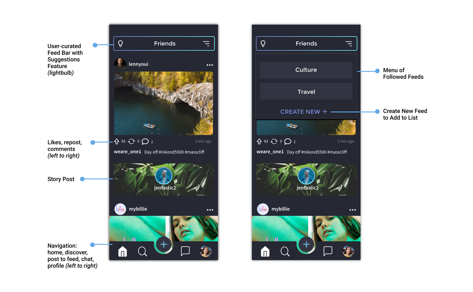

The feature of having multiple, topical feeds within one app is what most sets Aurora apart from our direct competitors. While the concept isn’t new (see apps like Pinterest or Reddit), it’s different from other apps because users are following personal or business accounts just like Instagram or Twitter, but are also given the ability to sort those accounts into buckets of their choosing. The main focus of the app is still socializing, but with an extra layer of control over what you see at any given time. The easiest example of how this might be useful is to imagine having a feed for World News and a feed for Humor. Sometimes a person may be interested in reading about trade tensions between the US and China, while at other times they may want to relax and look at content that makes them laugh. Having separate feeds means this person isn’t wading through news posts to find funny ones or vice versa.
Feature 2: Dislike button

Including a dislike button has two main functions: for users to get rid of ads that don’t apply to them, and to further filter normal posts that they don’t want to see. This is separated from the Like button because this action is invisible to other users. A person can dislike a post and give a reason they didn’t want to see it. We envision that in real-world implementations of the app we would use this data to find patterns of what the user didn’t want to see, and better tailor their experience based on this input. One user of our high-fidelity prototype said they felt calling this a “Dislike” button was confusing because on apps like YouTube or Reddit, dislikes or downvotes are visible to others, so there is a possibility of improving this feature by renaming it.
Feature 3: Interests on/off while searching

As a way to have a Discover page that cohesively brings together a user’s interests, we have created toggles for their chosen categories that help them explore in the same tailored way they consume their regular feeds. The Interests are not called Feeds, because multiple interests may fall under one feed a user has created (for example dogs and cats under Animals). Users have the options to discover under whatever categories they chose, or turn all their interests off and discover content trending outside their interests.
Feature 4: Suggestions

When a user creates a new feed, we first populate a page of suggested follows based on the interests they saved under that feed. In the example, we show how a user created a new Feed for music, so top music accounts are suggested accounts to follow. The purpose of this feature is to help users more conveniently curate a new Feed. Users can access the suggestions feature on old Feeds as well by clicking the lightbulb button in the top left corner of the screen. Suggested accounts then populate along the top of the Feed. Hitting the lightbulb icon again will make the suggestions disappear. Suggested accounts would be based on what others with similar interests follow.
Future Steps
Because we were tackling such a complicated problem space, we have many future steps we would have like to pursue this project. We have included the most compelling here:
Exploring our secondary user group — We are quite interested in the possibility of attracting non-social media users to this platform through our enhanced user control features.
Iterating on Search and Suggestions features — We noted in our second round of testing that these were the two places where our design lost clarity with our users. We would focus on improving these features in future versions of the app.
Adding Accessibility features — One area that many apps fall short in is allowing users to increase the size of images and text. We want to incorporate features like zooming in on captions, among others.
Refining the friend grouping — Not only do we want to allow our users to group their interests, but also their friends. This was something that came up multiple times in user interviews. People often have friend groups that occupy completely different areas of their life. We want their social media to reflect this.
Research on user boundary-setting — Many platforms are moving toward incorporating boundary settings for users, especially centered around time. We want to perform a second round of user research focused on this specific topic.
Verifying information — Concern over the reliability of the information on the internet surfaced many times throughout our research. While verifying the accuracy of information is a monumental task, we would want to research and explore options for how to help users do this.
Lessons Learned
Social media is something that currently touches so many lives. We felt this project brought us closest to what it meant to truly design for users, while also challenging us to imagine how our product would fit within a business model. This was an engaging and fulfilling project from start to finish, with dozens of lessons learned along the way. Below are some of our favorites:
The sequence of tasks in a usability test will affect the outcome because some tasks give context to others.
We came to fully appreciate the power of our data analysis tools (such as affinity diagrams) for allowing us to take in a vast amount of data and narrow it down to meaningful user insights.
We learned how to think creatively when user needs and business needs clash, and how to create features that support both.