National Weather Service
Website redesign for a US government agency.
Project Overview
My Role: UX Research, UI Designer, Interaction Designer
Team: Stirling Grodner: UX Researcher
Duration: 4 weeks
Tools: Paper + Pencil, Adobe XD, Miro, InVision, Google Slide
Website: https://weather.gov/
Summary: I had the opportunity to redesign a website for a government agency of my choice. After researching possible agencies and organizations, I chose the National Weather Service (NWS). I thought it would be an excellent opportunity to take on their website as I immediately noticed several user interface problems. I also felt there was value to supporting this agency as they provide more than the weather; they also provide extensive safety measures based on the severity of the weather, which immediately affects the US citizens.
😫 The Problem
Based on our research, we found that users who visit the site felt very overwhelmed due to text-heavy pages and found difficulty in locating vital information because the navigation and overall site were not intuitive.
😊 The Solution
Data supports that redesigning the website by integrating UI components and building an interface that is informative, engaging, and intuitive, will leave users to be potentially loyal to this service.
Research and UI Analysis
As a class project, we were tasked to search for a government agency that would benefit from a website redesign. After researching possible organizations and agencies, I chose to redesign the National Weather Service (NWS). The National Weather Service is an agency of the United States federal government that is tasked with providing weather forecasts, warnings of hazardous weather, and other weather-related products to organizations and the public for protection, safety, and general information.
At first glimpse, this site set itself apart from others as I noticed a significant amount of user interface problems and was excited to take on the challenge. This site holds great significance as it serves as the United States’ primary weather service, so the demand for a well-strategized UX design would be imperative at their level.
As a user researcher, I wanted to understand the pain points of how people use NWS. So, to start my research, I began with a proto-persona who I believed would be considered a typical user.
User Scenario: Michelle is a full-time truck driver who drives cross country. To prepare herself for routes, she needs detailed forecasts quickly and easily.

Proto-Persona
With the assistance of my research partner, we reviewed the usability methods of NWS’s website. To accomplish that, we listed the screens the proto-persona must visit to achieve her goals. We then created a wireflow which later, represents the user flow. (Wireflow available per request)
We completed a heuristics evaluation by following the user path of my proto-persona. We found that all heuristics failed except for clear purpose and fast loading times. NWS’s site also failed a color accessibility test.
My goals to solve these heuristic problems are by providing accessible and appealing features that are AA compliant throughout the interface redesign.

Heuristics Evaluation (Google Sheets)
To begin the redesign, we developed a testing plan which defined the objective: to gather data on NWS’s current site, and identified the usability issues of 4 essential tasks:
Look up your local forecast
Customize the homepage with your local weather
Find weather forecast using the interactive map
Check for a flood advisory
To conduct the guerilla test, I asked each participant to accomplish the tasks outlined in my user path. In total, I led, and screen recorded 5 participants for approximately 10 minutes each. While they performed the tasks, I took handwritten notes to obtain qualitative data. This helped me log any areas of confusion that arose, user’s questions, or issues as they clicked around the site.

Sample of quickly jotted notes during guerilla testings

User Feedback
To gain more in-depth insight into the user’s perception of NWS, I mapped out an empathy map by implementing the data from the usability tests. This exercise supported my goals to design with the user in mind without leading in personal assumptions.
Users felt:
lost and confused
annoyed, frustrated, and impatient
With the site’s poor navigation, users felt a sense of abandonment when trying to search for simple tasks and ultimately experienced all pain with no gain in completing their tasks.

Empathy Map (larger version available per request)
Next, I redlined and annotated usability, heuristics issues, accessibility issues, user errors, and pain points from 5 screens experienced during user testing. These annotations supported my goals to resolve visual issues that weren’t working, and later apply design principles throughout the interface redesign of NWS. (PDF of Redline Annotations below)

For the final stretch of my research stage, I assessed their competitor’s features, advantages, and user reviews to understand better how they tackled problems and to evaluate further how well their solutions can be useful for NWS. (View Competitor Analysis below)

Information Architecture
NWS’s website was cluttered with duplicate navigation items, while the overall experience felt overwhelming from text-heavy pages, meteorologist jargon, and overall felt very uninviting.
To solve this, my goal was to reorganize the site map and also develop a new brand voice to make the interface design more approachable, engaging, and visually stunning.
Card sorting was exercised for the primary and secondary navigation bars that appeared on NWS’s homepage.


NWS’s navigation had so many links, approximately 120+ index cards were used in this exercise.

Sorted and Categorized
I referenced results from the card sorting activity to identify content patterns, group “like items” together and labeled new categories. By removing duplicate navigation items and creating tertiary navigation, I was able to build a site map that was more structured and comprehensive.

Primary & Secondary Header

Two-Part Footer and Utility
Lo-Fi Wireframes & Prototyping
Before starting my designs, I selected a simple user flow that was created using my proto-persona scenario. Starting from the Homepage to Flood Safety, a truck driver wants to read safety tips for her next route.

User Flow
I completed three rounds of iterations on the lo-fi wireframing starting with a rough sketch of the homepage then taking those ideas digitally. (Please excuse my sad interpretation of the United States)

Sketch of NWS homepage
The goal of the lo-fi wireframes was to redesign an intuitive navigation bar and determine the content structure on each page before applying visual design.
On the homepage, I reconstructed the navigation, utilities, organized content, and sections relevant to the user’s needs. I provided options to further navigate throughout their user flow to accomplish a task. Cards highlight essential information with related images. Screens are designed for three breakpoints: desktop, tablet, and mobile with responsive menu navigations.

Lo-Fi home screens for Desktop, Tablet, and Mobile
Using the lo-fi desktop and mobile prototypes, I developed a usability plan and conducted in-person usability tests with 6 participants.
Objectives: Have a high success rate of users navigating to find the target page and accomplish their goals.
Test tasks:
Save local weather to your homepage with your zip code
Lookup Atlanta’s forecast offices
Find safety information on floods
Navigate to the Owl’s Education
Navigate to Cold and Flu Forecasts
Navigate to UV and Sun Safety Tip
Feedback from Lo-Fi Iteration 1
😊 Task 1: Successful — All users found the search bar for local weather
😫 Task 2: Fail — Issues locating where the forecast office would be
😫 Task 3: Fail — Unable to find information on floods
😊 Task 4: Successful — Found Owl’s Education
😕 Task 5: 50% Successful, 50% Fail: Issues finding Cold and Flu Forecast
😊 Task 6: Successful — All users found UV and Safety Tips
Personal Notes for Prototype Improvements
Task 1: OK — “possibly reposition for hierarchy” — feedback given from a user
Task 2: Make a button for Forecast Office accessible from the homepage
Task 3: Create Flood Link in Navigation also add a link to map key
Task 4: OK
Task 5: Change title name — users did not know what Cold and Flu Forecast meant
Task 6: OK
User Interface Design
Brand Voice, Tone Style
User insight shows the NWS’s website to be: overwhelming, inconvenient and dated. To solve this, defining a new brand would reduce user frustrations. I identified five adjectives that would assist the development of a voice, tone, and style guide. These elements will make a significant impact on increased productivity, quality communications and content, and user engagement throughout the new website.

Stylized Elements: Logo
I combined the current pictorial mark with a new typeface for the wordmark to give it a modern look. I took a contemporary approach because when researching NWS’s competitors, many reviews stated they enjoyed a modern and clean website design.

Stylized Elements: Color Palette
Since NWS provides more than weather forecasts, but safety alerts and warnings for severe weather, I chose a palette to promote trust, safety, and calmness to welcome the user. The colors chosen responded well when testing with my users.

Stylized Elements: Typography
For the redesign, I chose typefaces Roboto, and Roboto Condensed to create a friendly and natural reading rhythm making it readable and approachable for all users.

Stylized Elements: Buttons
NWS’s current site failed many aspects of color contrast for accessibility, including their hover state links. For this redesign, every color has been tested and successfully passed ADA color regulations.

Stylized Elements: Components
Based on user feedback on NWS’s current site such as overwhelming, text-heavy pages and clustered images, I approached the UI components with a very clean and minimal approach. I used a contrasting gradient for the forecast cards to express hierarchy. The map key in the bottom right was redesigned as users stated there was a lot of ambiguity between the color indicators. The map key was hugely crucial to the service of NWS as each color represents a different warning on their homepage’s interactive map.

Stylized Elements: Iconography
Again, I aimed for modern and minimalism and used icons to represent that. For NWS’s mobile breakpoint, I noticed that there were no icons used, which made it very difficult for users to navigate through easily. The weather icons also replaced NWS’s current choice of “icons,” which were snapshots of photos. The photos used in NWS’s existing website left too much room for uncertainty, especially for essential services such as the forecast.

Hi-Fidelity Prototyping
As my first responsive redesign project, I struggled a lot in developing an intuitive hi-fi prototype. By the end of this project, I designed multiple iterations between the lo-fi and hi-fi prototypes as I found that when users tested the iterations, several usabilities and visibility issues occurred.
😫 Frustrations —
colors used for the navigation and footer were too dark and gave a vibe reminiscent of a storm vs. my goal of wanting users to feel “calm and safe.”
active states were needed for the navigation to make it clear what page users are on
a mix of colors for body typography, such as grey and black left users confused
dropdown items were centered creating inconsistency and non-scannability
search functionality was too subtle for such a prime utility feature
service announcement was not prominent compared to other components on the homepage
Although I reached my deadline, I was determined to continue this project and produce a redesign that solved these frustrations. With my collected data and various feedback, I aspired to design a successful product. Please see the evolution of NWS below.
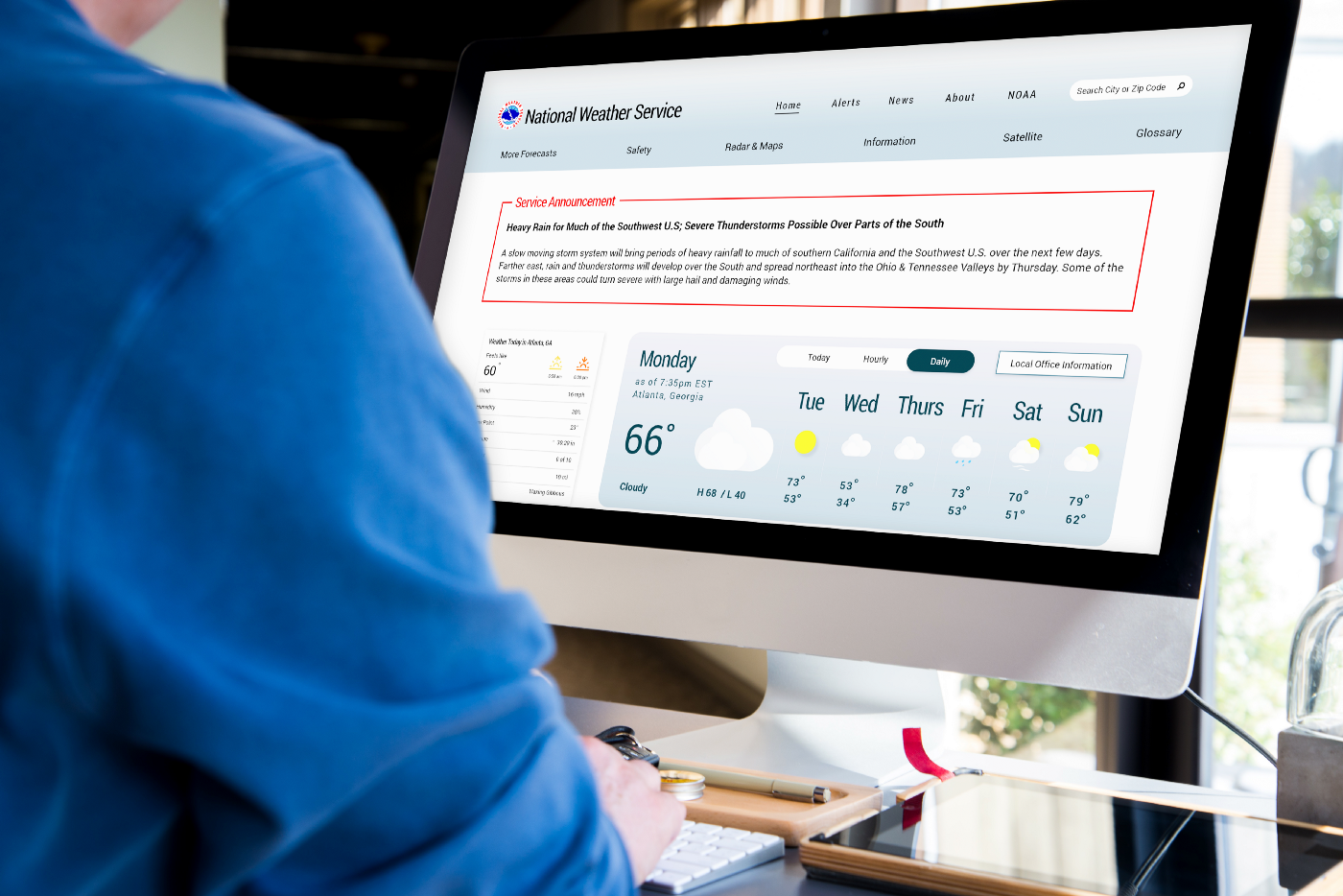
NWS current homepage:

A series of 5 iterations for NWS redesigned homepage:

The last NWS redesign for mobile, tablet, and desktop:

Reflections
💡 Keeping a consistent identity. NWS’s current website has a lot of ambiguity between its brand and supported department, NOAA. (National Oceanic and Atmospheric Administration) Throughout my research, I found that it confused users on what information came from where. With the NWS redesign, it was essential to show clarity that it was its own service with its own branding.
💡 Sitemapping is crucial for a successful user flow. Before the development of any design to the interface, building a structure that makes sense to the user is one of the most critical elements of web design. Card sorting methods supported the outcome of my sitemap, and without it would have been challenging for me to have a secure sitemap.
💡 UX writing is important. Through usability testing, it was discovered that the overuse of meteorology jargon left users disengaged and feeling confused. To give users a better experience interacting with the website using simpler words with a brand voice is useful for mass audiences.
💡 Challenged with responsive designs. People are continually accessing an increasing range of devices. As UX/UI designers, it’s important to be as adaptable as the various screen sizes as it’s essential to design for all elements in the digital world.
🔮 With the goals of delivering users an experience that is informative, engaging, and intuitive for the National Weather Service, future steps would include usability testing of the hi-fi prototype to support that.
🚀 Full Interactive Prototype
Go ahead… test the National Weather Service redesign!
Desktop: https://invis.io/7NX53CS9GD2
Tablet: https://invis.io/6VX54W33UQ4
Mobile: https://invis.io/2HWXL0N9KEG